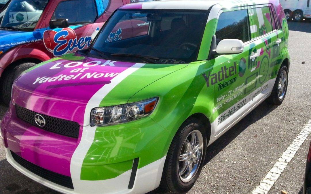
The best car wraps, truck wraps, and bus wraps all have one thing in common and that is expert attention to design. And whether you are going to come up with your own eye-catching wrap on your own, or are hiring a professional to do it for you, there are a few core qualities that always stand the test of time. Try thinking about incorporating a few of these design tips into your next car wrap.
The right palette
Conventional advertising wisdom might tell you that big and bold is always the way to go, and this is certainly true as long as you are looking to make a big and bold statement. However, the yellows and reds that may be great for one company or individual may be jarring for another. Ask yourself this: after you get your viewer’s attention, what kind of statement do you want to make to them? Do you want to be shocking or trustworthy, inspire curiosity or confidence? Chances are you already have a good idea of what you want out of your car wrap and so the next step is translating that into a palette that reflects the statement best.
A perfect font
Just like with the color palette, choosing a solid font is about knowing what kind of message you want to communicate — do you want to go bold and straightforward, or is something a bit more light and elegant better? But beyond this, a great font needs to do one thing: be read. So make sure you choose lettering that is legible from a distance, or after only a brief passing. Don’t let it blend in too much with its surroundings and let it stand on its own.
Placement
The other way that your message gets out to the world efficiently is when it is put in a spot that people can see. It may sound simple, but you might be surprised how often this easy tip is overlooked. For car wraps, the back and side of the vehicle are how most people are going to see your message. On busses, taking advantage of all that side real estate is definitely the way to go.